How our rebrand increased website views by over 1000% and increased sales and brand awareness ten-fold.

Send Help!
As you can see below, the old logo and branding was in need of a serious makeover. We're talking from the ground up. We're talking burn it with fire, put out the fire, then burn it again just to make sure everything of that old old branding was gone forever. Except of course for these examples we kept to show you nice people. Below you can see a side by side of the old vs. new logo. That was just the start, carry on to see how we brought Evotel to life.


Phase 1 / Strategy + Approach
DEVELOPING THE STRATEGY
Over a week-long session, we surfaced the challenges Evotel as an organization faced. In the process, they prioritized the needs and goals of the business and its customers. This became the foundation for the branding and marketing plans going forward.
DEFINING THE BRAND
Through a series of exercises in the strategy session, we were able to extract and refine the key pillars of the brand and how they wanted their core values to come across. This defined the brand’s personality, how it should look, sound, and act.
POSITIONING
Understanding what the Evotel brand is and who they are a champion for helped define positioning statement for the brand: They want to uncomplicate fibre, from the process to getting it to the way it's used, and get it into every home in South Africa.

Phase 2 / Brand Refresh
OMNI developed an entire identity system to make sure every customer touch-point reflected the brand. The rebrand included updating the logo, introducing a new colour palette, a new typeface, and a style of photography. This created a more cohesive experience and atmosphere across all digital and printed platforms.


The Brand guidelines.
It's all well and good to develop an identity system for a brand but then it doesn't get put to good and proper use later down the line. To ensure the brand always looked in tip top shape and was used correctly we created a detailed and extensive brand guideline that outlined the rules of the identity. It included tone of voice, colour palettes, typefaces and examples on how each element was o be used correctly. The result is a consistent look across any platform that is uniquely Evotel.


Identity Collateral
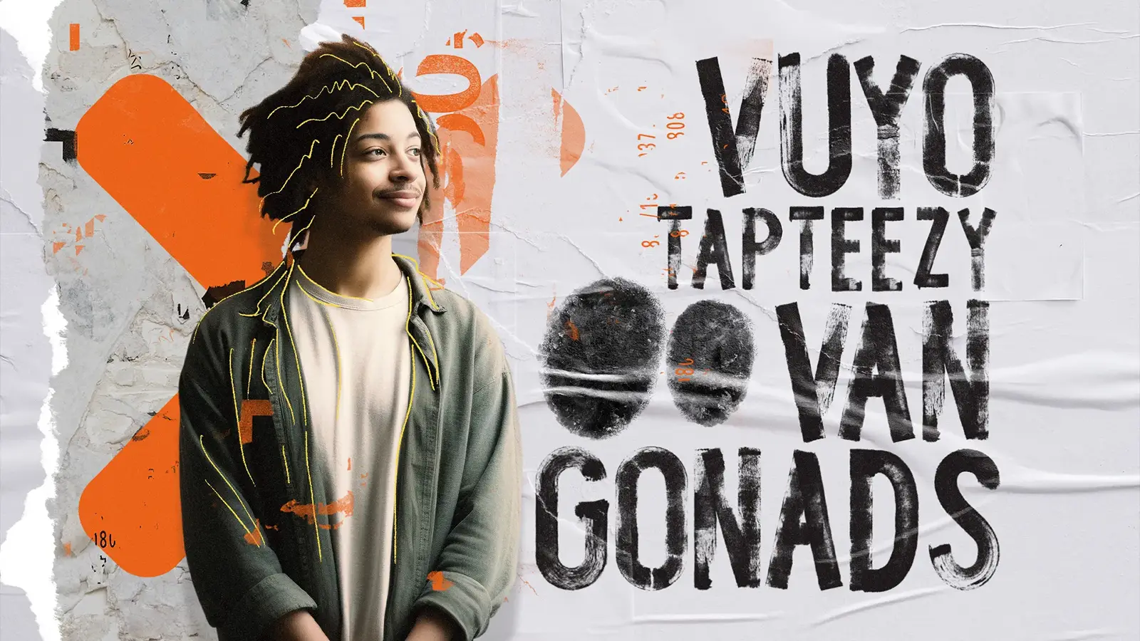
With any branding project there are a plethora of assets that need to be created to ensure brand continuity across all platforms. These included all print and advertising assets, internal company assets as well as digital marketing collateral.


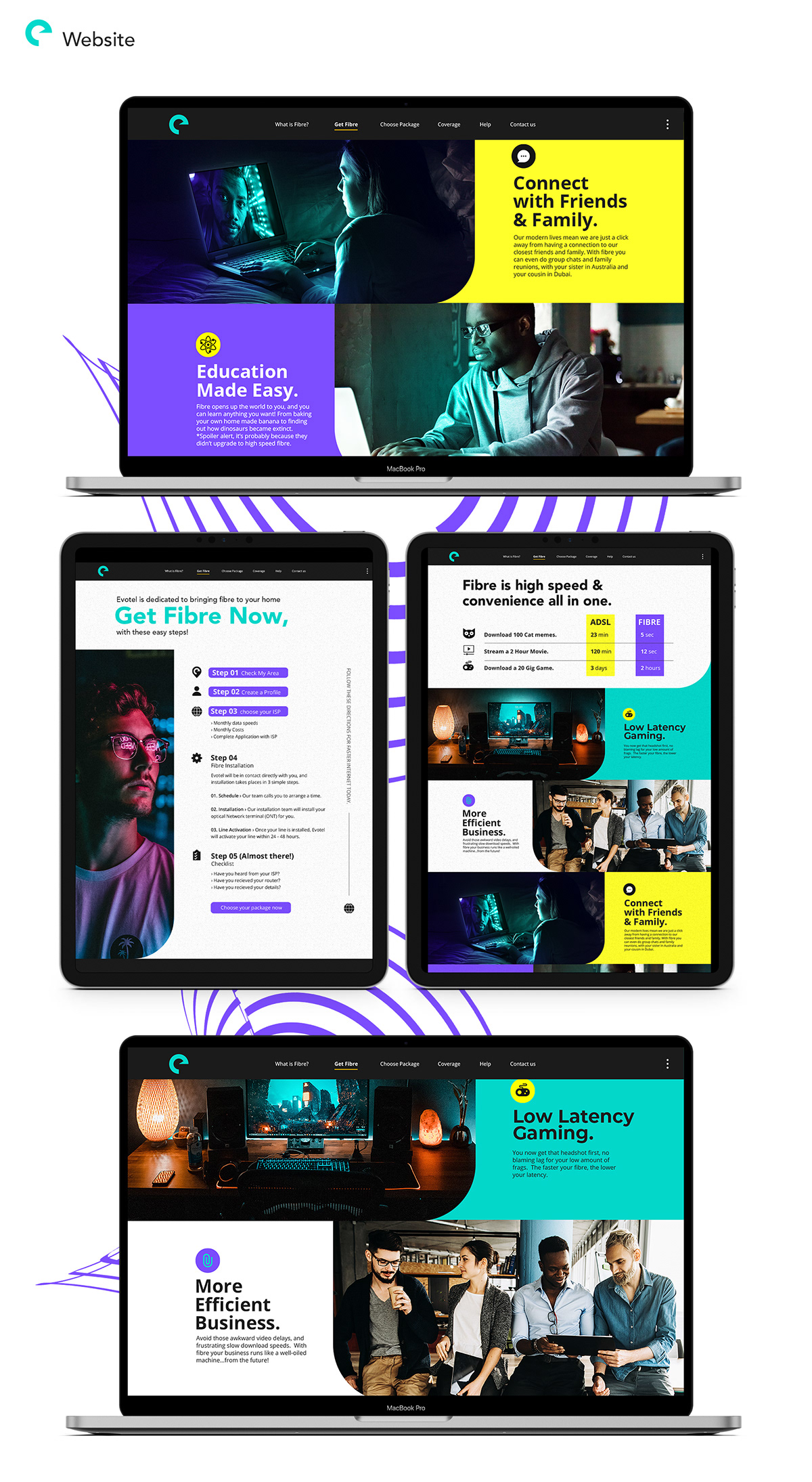
Website Redesign
When you design interfaces it's always a balancing act between business objectives, user goals and aesthetics. It's not often that all three align perfectly like the Evotel site. It provides a clear journey for new visitors to guide them through the fibre process yet also allows current users to manage their account all while keeping a friendly, fun and sometimes quirky tone of voice.
See the live website here: evotel.co.za

The Outcome?
Increased conversions, increased page views, a massive increase in new users and sales, and one very happy client.


Credits
Client: Evotel | Creative Director: Waldo Buchner | Art Director: Chris Savides
Design + Video Edit: Jared Van Damme | Animation: Waldo Buchner
Design project lead: Chris Savides | Copyright 2021 OMNI Creative Pty (Ltd)